

Olumo
People analytics that deliver workplace experience to drive business results.
Olumo is a platform for leaders (managers, business owners, HR, etc…) to get honest feedback from employees on a number of topics including how they feel about the leadership within the company, their own career progression, their well being, and many many more subjects.
The platform not only gives you the data, but also instructs you on the best course of action to increase overall employee well-being.
My role
I was the principal designer for the web app. I was responsible for taking the requirements and building out the end-to-end experience. There are many moving parts involved in the Olumo product, so making sure there was a seamless experience between them took a lot of iterating on conceptual wireframes before the visual design was ever considered.
There were many complicated problems that needed to be solved — A custom bulk uploader, a global filter that kept employees anonymous but showed the raw data, a view and sort mechanism that helps you navigate hundreds of unique metrics, a notification center, a custom survey builder, etc..
If I tried to cover every feature and ever decision that went into them, this would end up being a novel. So I will only cover a few main pieces of Olumo.
Design Process
Olumo had an MVP already in place and was testing it on their first clients. It was a clunky confusing piece of software that really wasn’t a good starting point. We needed to take a step back and define the goal before we tried re-skinning any of the current product (which we did NOT end up doing). Olumo had gathered some rather interesting data: Customers were happy to get data about how their employees honestly felt, but what next? How do they use the data to make impactful changes? That became our main focus. Empower the business leaders to confidently make meaningful changes that leave a lasting positive impact on their employees.

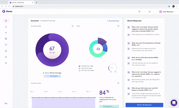
Understanding the Data
There were many friction points the customer was confronted with after the survey process was complete. One of the biggest pain points was reading and understanding the results from the survey. The metric titles were ambiguous and the values were from -100 to 100. Right off the bat, your average manager, or HR employee would need to do quite a bit of research to understand what these things meant. We knew immediately that the easiest way to make these metrics more understandable was to make the copy more descriptive. In fact, the visual design didn’t change much except for looking more modern and matching the branding that we implemented for them. Outside of that we added tooltips that described how the report works.
Onboarding
There was a big barrier to entry getting started on Olumo. You had to import all of your employees with all of their subsequent details. The way they bulk uploaded was to give you a .CSV template and force you to conform to their column names. It was a lot of work and Olumo saw a lot of churn at this part of the process. We worked on a bulk upload feature which was simple but effective. It provided the same .CSV template, but let you fix discrepancies after it was uploaded. After it was released, Olumo was still seeing churn at this point in the process. After research (user interviews) we discovered it was the template. The people who are uploading the employees already have a file on their desktop that they want to upload, rather than manually copying the info into another spreadsheet. So we built the column header matching system which allows you to upload your own file, and just match the column headers with the ones that Olumo needs.
See Olumos CEO describing the upload process
Global Filter
Since Olumo handles metrics and data from your entire company on nearly every screen, we noticed the need to make the filter global rather than only on a few screens. Since this filter would affect the content displayed on every page, we needed to really explore how it could negatively and positively impact each portion of the app. One of the hurdles we came across was anonymity. The responses employees give to their leadership are always anonymous. However if a leader were to drill down far enough into the filter, they could use deductive reasoning to assume who the employee was that gave the feedback. In order to discourage this, we added an error message to the filter if they got too granular with their search. Once there were 14 or less employees being filtered, the message Not enough employees selected for filter anonymity would appear.
Playbook
This portion of the app is where the value is seen. Playbooks are interactive guides for improving your workplace. They are specifically targeted towards your lowest performing metrics and walk you through how to raise them.
There needed to be a large enough index of playbooks to be valuable for any general issue an organization could be facing. Once in the playbook, the flow needed to be clear enough to show what steps needed to be taken. At first glance it looks like a blog of sorts, but as you go through it you are prompted to start new survey campaigns that drill deeper into your employee pain points. You are also given best practices for your organizations issues from experts in leadership coaching.

Still going
This project may have begun at the beginning of 2019, but we are still very much improving the product based on customer feedback and data gathered. I’ll keep this updated as the product evolves.

Marketing Website
The website was a team effort, but I am responsible for these two pages: